

ID Design
The ID system is friendly but bold. The colon was designed to be the icon for the brand. The halo within the colon is a metaphor: a combination of mind and body. We used the color yellow to represent the idea that we need to pause and slow down. Yellow communicates yield but also represents energy and a vibrant source of power.

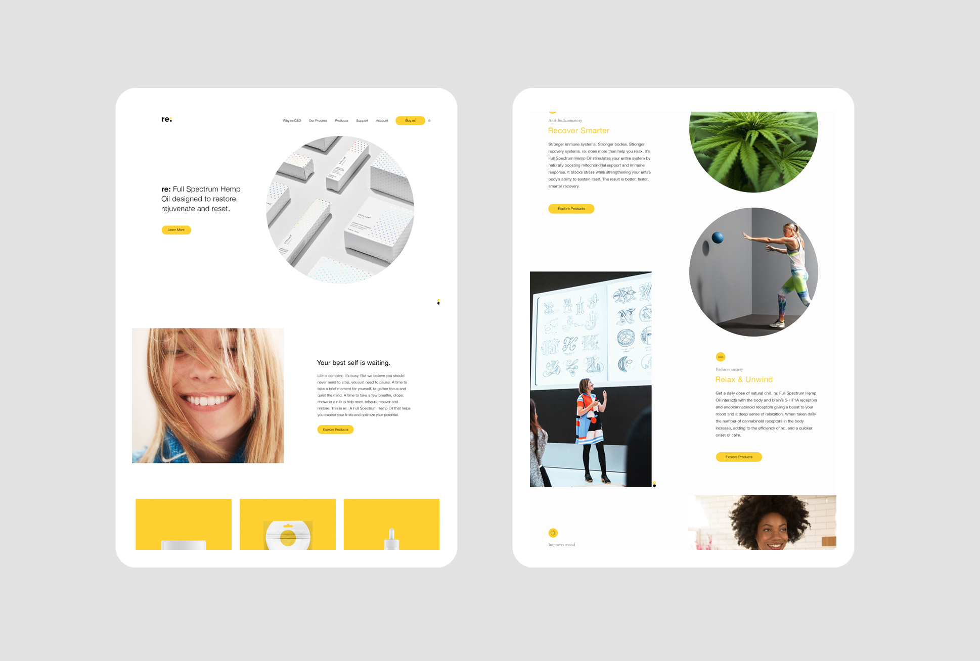
Design
Complexity is the enemy, our audience’s lives are complicated enough, so the design needed to reflect the state we wanted to achieve; clarity, focus and a sense of calm.


Strategy
Brand Positioning
Brand Architecture
Brand Strategy
Content
Strategic Naming
Copywriting
Design
ID Design
Package Design
Creative Direction
Illustration Direction